Ever wondered why some nights you drift off peacefully whilst others leave you tossing and turning? The answer might be staring you in the face – quite literally.
Your bedroom colours have a direct impact on how well you sleep. Research reveals that people with blue bedrooms enjoy around 7.9 hours of quality sleep each night, compared to just 6.8 hours for those sleeping surrounded by purple walls. That’s over an hour’s difference – and it’s no coincidence.
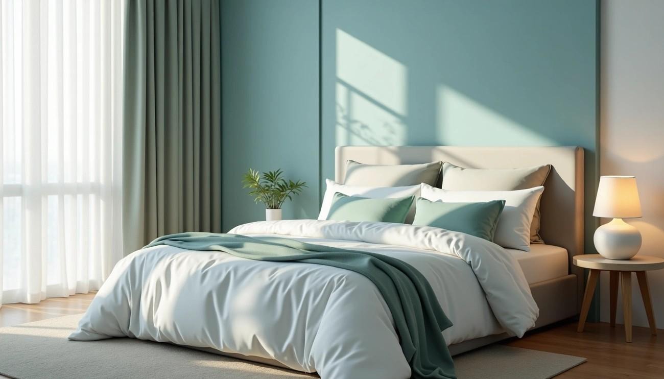
Your bedroom should be your personal sanctuary. A place where you can truly unwind after a long day. The colours you choose for this space don’t just look good – they actively work to improve your sleep quality and overall well-being.
Blue stands out as the champion of bedroom colours for good reason. This calming shade actually slows your heart rate and reduces blood pressure, creating the perfect conditions for deep, restful sleep. When you need to switch off from the day’s stresses, blue creates that soothing atmosphere you’re after.
Whether you’re battling sleepless nights or simply want to create a more peaceful retreat, understanding how colour affects your sleep can completely transform your bedroom. We’ll show you exactly which colours work best for sleep, how different shades influence your mood, and give you practical tips for creating your own sleep-friendly haven.
How bedroom colours affect your mood and sleep
The colours surrounding you whilst you sleep are working behind the scenes in ways you might never have imagined. Far from being purely decorative, they’re actively influencing your brain through complex pathways that science is only just beginning to understand.
Emotional responses to colour
Your brain doesn’t process all colours equally. Most of us naturally gravitate towards cool-toned shades with shorter wavelengths when decorating interior spaces. This isn’t just personal preference – it’s rooted in how these colours make us feel.
Each colour triggers its own emotional response:
- Blue wraps you in feelings of calmness and security
- Green brings comfort, peace and that connection to nature we all crave
- Red gets your pulse racing – sometimes in excitement, sometimes anxiety
- Purple sparks creativity but can leave some feeling restless
Why does this matter for your sleep? Poor mood before bedtime can seriously sabotage your rest. Research shows that emotional distress leads to decreased sleep efficiency and you’ll spend less time actually sleeping. Surround yourself with colours that lift your spirits, and you’re setting yourself up for better sleep.
Physiological effects on sleep
Here’s where it gets really interesting – these aren’t just feelings. Your body physically responds to different bedroom colours in measurable ways. Blue genuinely reduces heart rate and blood pressure, whilst red actually increases brain activity and gets your heart pumping faster.
When your brain encounters stimulating colours like red, your hypothalamus kicks into gear, producing more cortisol (that pesky stress hormone) and less melatonin (your natural sleep aid). The result? Poorer quality sleep. Compare this to blue bedrooms, where a 2013 study found people enjoying an impressive 7 hours and 52 minutes of sleep on average.
This happens through specialised receptors in your retinas called ganglion cells, which are particularly sensitive to blue light. When they detect it, they send calming signals straight to your brain. Interestingly, recent research reveals a fascinating contradiction – warmer room colours like red and orange actually result in lower melanopic lux compared to cooler shades like green and blue.
Image credit Bedstar: Cornflower blue and taupe bedroom décor and wooden bed frame.
Cultural and personal associations
Your background shapes how you respond to colours more than you might realise. Cultural influences play a massive role. Red spells good fortune in Eastern cultures, whilst Western traditions link it to passion or danger.
The Ecological Valence Theory explains this beautifully – you prefer colours connected to things you love. Simple as that.
A fascinating cross-cultural study found that Japanese people chose neutral palettes with sharp contrast, Americans went for low contrast with warm tones, Koreans favoured neutrals, and English participants gravitated toward warmer shades.
Takeaway Tip: Your personal associations can trump general guidelines. If soft yellow reminds you of peaceful childhood mornings, it might work better for your sleep than the universally recommended blue.
Don’t forget, your individual experiences with colours matter just as much as scientific recommendations.
Best bedroom colours for sleep and why they work
Choosing bedroom colours isn’t just about what looks good – it’s about creating a space that actively helps you sleep better. Certain shades have been proven to improve sleep quality through genuine psychological and physiological effects.
Blue: the ultimate sleep champion
Blue bedrooms consistently deliver the best sleep results. This calming shade works its magic by naturally slowing your heart rate and reducing blood pressure – creating the perfect conditions for deep, restful sleep.
What makes blue so effective? It reminds us of clear skies and calm waters, instantly triggering feelings of tranquillity. Whether you prefer light sky blue, sophisticated teal, or deep navy, this versatile colour adapts to any bedroom style.
Blue’s sleep-boosting qualities include:
• Lowers blood pressure and slows respiration • Creates feelings of security and satisfaction
• Works beautifully with both contemporary and traditional décor • Pairs effortlessly with other calming colours
Green: nature’s restful retreat
Green sits perfectly in the middle of the colour spectrum, offering the ideal balance between energising warm tones and soothing cool ones. This connection to nature, growth and renewal makes green bedrooms feel instantly peaceful.
From soft sage to rich forest green, you’ll find variations to suit your style. Green works brilliantly as a foundation colour, allowing you to create anything from botanical-inspired schemes to sophisticated, spa-like sanctuaries.
Neutral tones: timeless tranquillity
Image credit Bedstar: Bali Bookcase oak double bed, neutral toned bedroom décor.
Beiges, creams, and soft greys create beautifully calming bedroom environments that never go out of style. These versatile shades can feel cosy and warm or light and airy, depending on how you style them.
Think of neutrals as having visual softness – just like your bedroom needs tactile comfort through soft furnishings. Neutrals serve as perfect backdrops, letting you introduce personality through colourful cushions, lampshades, or artwork.
White: clean simplicity
White rooms stimulate your brain less than colourful spaces, potentially helping clear your mind before sleep. This clean, calming backdrop makes your bedroom feel instantly more serene.
Don’t worry about white feeling cold or sterile. Warm up off-white walls with modern furniture in earth tones like olive green, mauve, or dark blue. Add a few bold blue accents through throw pillows or artwork to create the perfect sleep-friendly combination.
Takeaway tip: White palettes become truly soothing when balanced with natural materials and textures – think linen bedding, wooden furniture, or woven rugs.
Which colour will suit your sleep style?
Your perfect bedroom colour isn’t just about following trends – it’s about finding what works for your unique sleep patterns and personality. The colours that help your neighbour drift off peacefully might keep you wide awake.
Match your colour to how you sleep
Different sleep styles call for different colour approaches. Think about your own sleep patterns before picking up that paint brush.
Struggle to fall asleep? Cool colours like blue or green promote the relaxation you’re after. These shades naturally slow down your mind and body, making it easier to switch off from the day.
Early riser who wakes up feeling groggy? Consider warmer tones such as light yellow. These gentle shades can help lift your mood and reduce stress the moment you open your eyes.
Light sleeper who gets disturbed easily? Neutral colours work brilliantly by limiting visual distractions. A calm, unified palette helps maintain the peaceful atmosphere you need for uninterrupted rest.
Tend to oversleep or struggle with morning motivation? Add some energising accents – perhaps soft orange elements to create warmth and inject positivity into your wake-up routine.
Your personality matters too
The colours you’re drawn to reveal a lot about what makes you feel comfortable and secure. Research shows some fascinating patterns:
- Blue lovers tend to value harmony and peaceful environments
- Green enthusiasts often seek security and connection to nature
- Yellow fans are typically warm, innovative souls
- White admirers generally prefer clean, organised spaces
Don’t overlook pink, especially the dusty and pastel varieties that work beautifully in sophisticated adult bedrooms. Pink creates feelings of love and kindness – surprisingly effective for promoting restful sleep.
Design expert Joanna Ross suggests starting with “warm neutrals and pastels” as your foundation for relaxing bedroom ideas. Sleep expert Martin Seeley adds that neutral colours create balance whilst limiting distractions, resulting in that calming environment you’re trying to achieve.
Sharing your bedroom space
Couples often face the challenge of different colour preferences. The trick lies in creating a space that feels unified yet personal to both of you.
One smart approach involves selecting two complementary colour palettes – perhaps Overtly Olive and Soft Peach with Rock Salt as your neutral base. This way, each person’s preferences shine through without creating visual chaos.
Alternatively, find a mutually appreciated accent colour that brightens the entire room. Yellow trims can add character that both occupants enjoy. Yellow brings warmth, positivity, and happiness – perfect qualities for a shared sanctuary.
For smaller shared bedrooms, neutral colours work best as they make your room feel larger. Use them as clean backdrops for introducing individual touches through bedding, artwork, or decorative elements that reflect each person’s personality.
Practical tips for applying calming bedroom colours
Now you’ve chosen your perfect sleep-friendly colours, it’s time to put them to work. How you apply these colours makes all the difference between a bedroom that simply looks good and one that actively helps you sleep better.
Start with a base colour
Image credit Bedstar: 60 30 10 interior design rule concept.
Pick one versatile shade to anchor your entire scheme. This foundation colour should be one of those sleep-friendly options we’ve discussed – blue, green, or a soothing neutral. Your base colour needs to do the heavy lifting, covering around 60% of what you see when you look around your room. Follow the tried-and-tested 60-30-10 rule that interior designers swear by: 60% base, 30% secondary, and 10% accent colours.
Stuck on which colour to choose? Look at what you already have. Marianne Shillingford, creative director at Dulux, suggests building “a versatile palette that can be updated as your tastes change”. Your existing bedding, artwork, or favourite throw might already hold the perfect colour scheme waiting to be expanded.
Use accents to add depth
Here’s where you can have some fun. Accent colours bring your bedroom to life by creating visual interest and contrast. Edward Bulmer, paint expert and interior designer, recommends using “deeper tones of the main colour or using complementary opposites” to achieve this effect.
Don’t just add one splash of accent colour and call it done. Weave your chosen accent throughout the room:
- Lampshades and cushions
- Headboards and window dressings
- Rugs and wall art
Test before committing
This step could save you from a costly mistake. Testing paint colours properly is essential, yet so many people skip it. Virtual apps that show colours on screens are helpful, but nothing beats seeing actual paint on your walls under your specific lighting conditions.
Here’s a professional tip: paint your testers onto lining paper, not directly onto the wall. One interior expert explains: “painting testers directly onto the wall gives you a false reading. The existing colour beneath will interfere with how your eye sees the new shade”. Lining paper lets you move samples around easily and see how different lighting affects the colour throughout the day.
Think beyond walls: furniture and textiles
Your sleep-friendly colour scheme shouldn’t stop at the walls. Bring those calming hues into every element of your bedroom through furniture, textiles and accessories. Joanna Ross, design expert, suggests that “creams, gentle beiges and soft spiced shades are the perfect starting point for relaxing bedroom ideas”.
Consider your bedding, curtains, rugs and decorative pieces as opportunities to reinforce your colour palette. This approach gives you flexibility – you can make seasonal changes whilst keeping the sleep-supporting foundation of your chosen scheme intact.
Lighting and room layout considerations
Your bedroom lighting and colour work hand in hand to create the perfect sleep environment. Light doesn’t just show off your chosen shades – it completely transforms how they look and feel throughout the day.
How light affects colour mood
That beautiful yellow paint you tested might look completely different once it’s on your wall. The same shade can appear warm and inviting in morning sunlight, yet dull and lifeless under your bedside lamp. Natural light exposure actually boosts your psychological well-being by reducing stress and agitation levels.
Don’t make the mistake of choosing colours based on how they look in the paint shop. Test your chosen shades under your bedroom’s specific lighting conditions – both natural daylight and your evening lighting setup.
Choosing colours for small vs large rooms
Room size should guide your colour decisions. Small bedrooms benefit from light-reflective paints that bounce light around, making cramped spaces feel more spacious. Dark colours work differently – they can actually create depth by making walls appear to recede.
Got a room with high ceilings but not much floor space? Paint your ceiling in a deeper shade to bring the proportions into balance. This simple trick helps create a cosier, more intimate atmosphere perfect for sleep.
Creating flow with adjacent spaces
Your bedroom shouldn’t exist in isolation. Create visual harmony by connecting it with neighbouring rooms through thoughtful colour choices. Pick two related shades from the same paint strip and use the brighter one in well-lit areas.
This approach works particularly well in L-shaped bedrooms or en-suites where one space flows into another. For naturally darker bedrooms, embrace their moody character with deeper shades rather than fighting against the limited light. Sometimes working with your room’s natural characteristics creates the most restful atmosphere.
Conclusion
Your bedroom colours hold the power to transform your nights – and the science backs this up completely. Blue remains the clear winner for quality sleep, whilst green brings that natural harmony your mind craves after a busy day. Don’t overlook neutrals and white either – these understated shades work quietly to calm your thoughts when it’s time to rest.
The secret lies in matching colours to your unique sleep style. Are you someone who struggles to switch off? Cool blues and greens will become your best friends. Do you share your space? Neutrals provide the perfect foundation for creating harmony whilst expressing individual personalities.
Remember, your colour choices should reflect who you are. Trust your instincts – if a particular shade makes you feel peaceful and content, it’s probably right for your space. Cultural backgrounds and personal memories often trump general rules, so don’t ignore what feels right to you.
When you’re ready to start your bedroom transformation, begin with that all-important base colour covering around 60% of your space. Build from there with thoughtful accents that add personality without overwhelming your senses. And always test colours properly – what looks perfect in the tin might surprise you under your specific lighting conditions.
Your sleep sanctuary extends beyond just wall paint. Bring your chosen palette to life through bedding, curtains and accessories. This approach gives you flexibility to refresh your space seasonally whilst maintaining those sleep-supporting benefits.
Creating a sleep-friendly bedroom through colour is one of the simplest changes you can make with the biggest impact on your well-being. Whether you choose calming blues, refreshing greens, or sophisticated neutrals, you’re investing in better nights and brighter mornings.
The science is clear – the right bedroom colours can be your secret weapon for consistently better sleep. So why not start planning your perfect sleep sanctuary today?
Key Takeaways
Understanding the science behind bedroom colours can dramatically improve your sleep quality and overall wellbeing through proven psychological and physiological effects.
• Blue bedrooms deliver the best sleep quality, averaging 7.9 hours per night compared to 6.8 hours in purple rooms
• Cool colours like blue and green actively reduce heart rate and blood pressure, creating ideal physiological conditions for rest
• Choose colours based on your sleep patterns—light sleepers benefit from calming neutrals whilst early risers prefer energising warm tones
• Test paint colours on lining paper rather than walls to see true colour behaviour under your specific lighting conditions
• Apply the 60-30-10 rule: 60% base colour, 30% secondary shade, and 10% accent colours for optimal visual balance
The right bedroom colour scheme works as a silent but powerful tool for better sleep, making it one of the simplest yet most effective ways to transform your nightly rest and overall health.
FAQs
Q1. What colour is best for promoting sleep in a bedroom? Blue is widely considered the most effective colour for promoting sleep. It has been shown to create a calming environment, reduce heart rate and blood pressure, and help people achieve an average of 7.9 hours of sleep per night.
Q2. How do bedroom colours affect mood and sleep quality? Bedroom colours can significantly impact mood and sleep quality through psychological and physiological effects. Cool colours like blue and green tend to promote relaxation and calmness, while warmer colours can be more stimulating. The right colour choice can help reduce stress and create an environment conducive to restful sleep.
Q3. Are neutral colours good for bedrooms? Yes, neutral colours such as beige, cream, and soft grey are excellent choices for bedrooms. They create a calming, versatile environment that can easily be personalised with accents. Neutral tones also help to minimise distractions, potentially benefiting light sleepers.
Q4. How can I choose the right colour for my bedroom? To choose the right bedroom colour, consider your sleep habits, personal preferences, and the size of your room. Test paint samples on lining paper to see how they look in different lighting conditions. Remember to apply the 60-30-10 rule: 60% base colour, 30% secondary shade, and 10% accent colours for a balanced look.
Q5. Can bedroom colours really improve sleep quality? Yes, research suggests that bedroom colours can indeed improve sleep quality. For instance, people sleeping in blue bedrooms have been found to get nearly an hour more sleep compared to those in purple bedrooms. The right colours can create a relaxing environment that promotes better sleep by reducing stress and supporting the body’s natural sleep-wake cycle.