A shelter isn’t just about blocking the weather. In busy event spaces, that fabric overhead becomes the first thing that catches the eye. First judgments happen fast, before anyone steps close. Messy prints or fuzzy images tell people we don’t care about details. Sharp layouts and smart color choices, because those pull visitors in without shouting. Professional custom canopies with well-designed covers don’t hide; they guide, attract, and hold. What hangs above can decide who stops below.
5 Expert-Loved Tips to Mastering Visual Appeal With a Custom Canopy

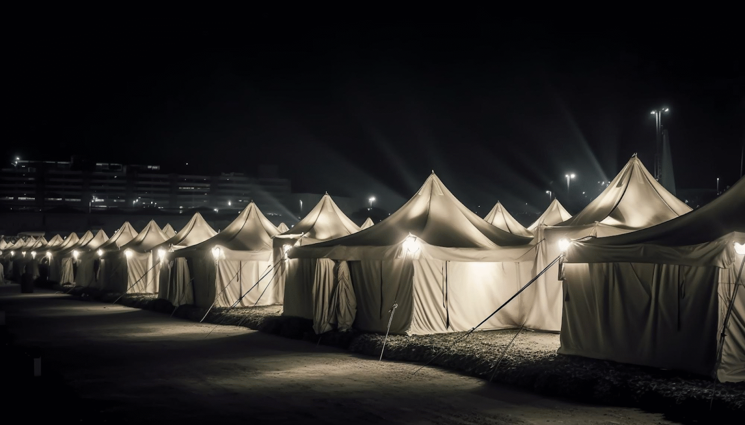
Source Link – Freepik
1. Embracing the Philosophy of Less is More
Most times, companies pile on details, services, bullets, and phone numbers right across the whole tent space. This almost always fails. Busy areas demand clear sightlines; too much noise makes people ignore it completely. Our move? Strip it down until only what matters shows through. When working with custom tents, a strong logo stands front and center, paired with a short phrase spelling out what matters most. Attention grabs fast under the canopy, yet decisions come later through team chats or printed details.
2. Leveraging the Peak for Maximum Visibility
Picture this: tents everywhere, packed tight. Right at the top, where eyes naturally lift, sits the prime spot, not down low, where people block the view. That high point grabs attention before anyone even steps close. Instead of crowding the middle, we go bold up above. The highest stretch shows what matters most, standing out like a signal in open space. Underneath, along the edges that hang down, simpler details live. A name. A link. Just enough to stick in memory when someone passes by. A clear message honors the pace of the environmental world. People walk by a string of displays and have a biased mind. A simple canopy design can cut through all that quickly. A single idea, a single message, or a single reference can get that glance.
3. Utilizing High Contrast Color Palettes
Picture this: soft tones look clean online, yet vanish amid the mess of street fairs or loud arenas. Bright clashes, think orange against black, catch attention fast when set beside open air or pale hall roofs. Greens that match lawns? Blues like clouds? They fade unless outlined in something bold. Sudden shifts in shade pull glances without asking. That snap of contrast makes our spot stand out from nearby stands.
The colors, however, need to take into account the sense of brand personality, not merely visual appeal. “High contrast doesn’t equal bright colors.” The idea is to find a balance where you can stand out based on the adequate separation, yet also be professional through the subtle restraint. When you find a sense of support through colors that don’t overpower, a canopy is no longer loud.
4. Insisting on Vector-Based Artwork
Picture sharpness hints at how trustworthy a company seems. A fuzzy logo stretched across ten feet can wreck credibility fast. Our big prints always use high-resolution files built with vectors. Scaling up JPEGs or PNGs makes them break apart, but math-driven vector shapes stay perfect no matter the size. Focusing on such details quietly shows we care about delivering solid results.
With large format printing, every flaw will be magnified manifold—be it edges, curves, or spacing issues. This problem disappears with vector images that scale accurately, even for enormous sizes, while maintaining perfect precision with the end result.
5. Designing for the 360 Degree Experience
Most people overlook how movement comes from every direction, not only ahead. Our custom visuals work well no matter where someone is standing. When the setup allows, we turn the rear panel into a two-faced feature instead of treating it like a flat surface behind everything else. Inside surfaces get printed too: walls, ceilings, and the parts you see once you’re within the area. Surrounding guests with consistent messaging makes the moment feel thought through and elevated without trying too hard.
Final Thoughts
A single cloth becomes more than shelter when thought shapes every thread. Simplicity pulls focus, not noise. High-traffic spots get used wisely, never wasted. Precision matters; every seam and every angle works exactly right. The space around it breathes the brand from all sides. People notice clean ideas that don’t shout. When visuals make sense without explanation, eyes stay longer. Trust builds quietly through clarity. Attention arrives where confusion is left out.